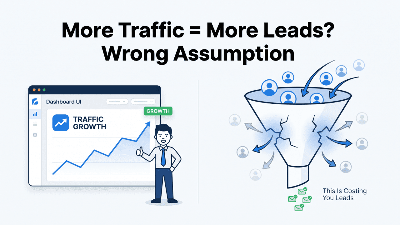
The Biggest Mistake Most Websites Make
Most businesses invest heavily in making their website look impressive. Clean design, animations, modern UI. But despite all this effort, leads don’t increase. Why? Because the goal was to impress—not to convert. Attention is achieved, but action is missing.
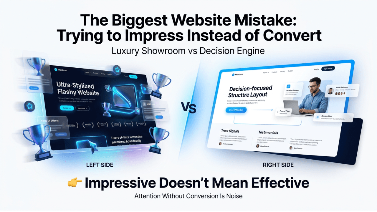
Impressive Websites Don’t Always Convert
A website can look beautiful and still fail to generate leads. Conversion is not driven by design alone—it is driven by clarity, structure, and direction. Design attracts users. Direction moves them forward
What Actually Happens on Most Websites
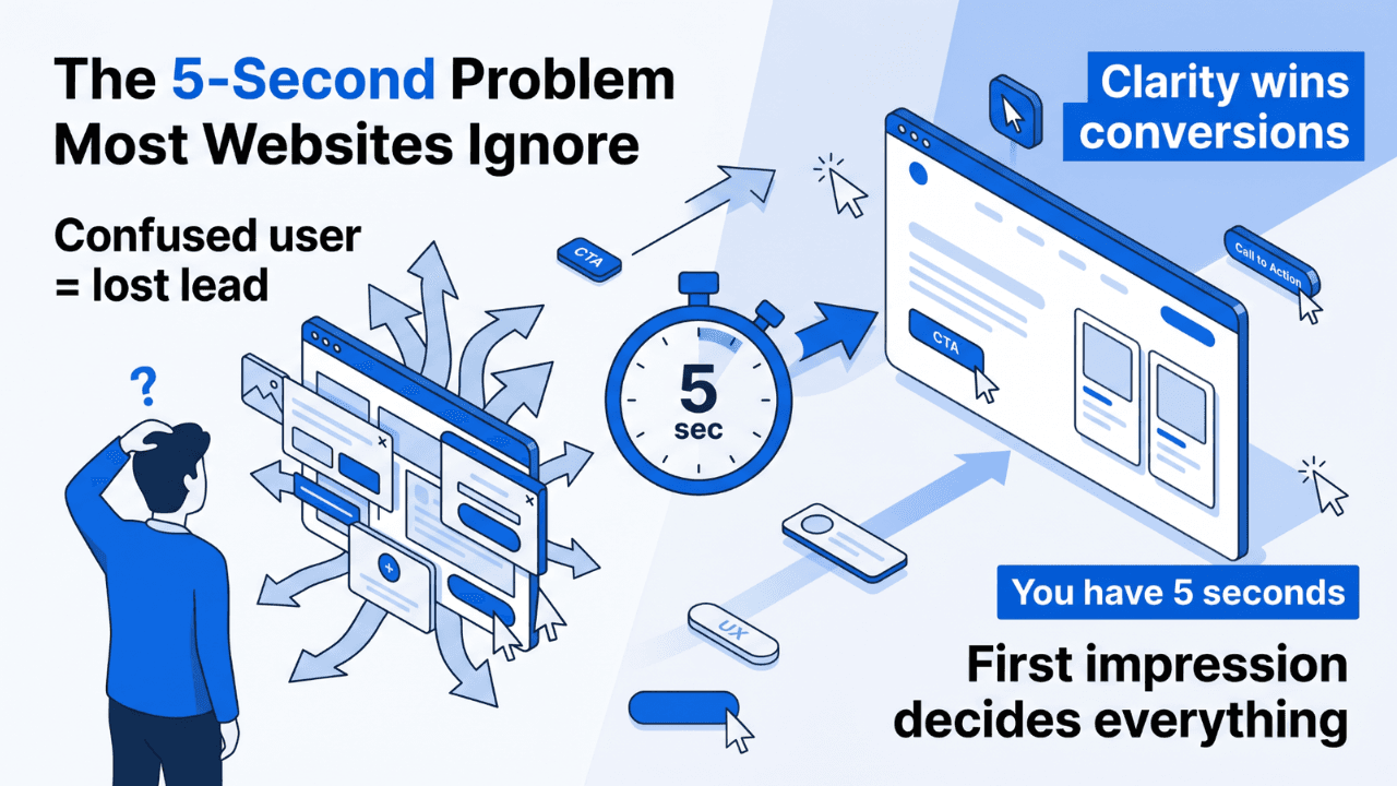
Visitors land, scroll, explore, and leave. Not because they disliked the design—but because they didn’t know what to do next. Attention without direction becomes distraction.
The Real Problem: No Clear Direction
Most websites fail to guide users toward a clear action. No strong CTA, no guided flow, no defined next step. When direction is missing, users hesitate—and hesitation kills conversion
Most Websites Look Good. High-Performing Websites Guide Decisions
This is the real difference. Most websites are designed to look good. High-performing websites are designed to guide decisions. Web design creates perception. Conversion systems create outcomes
Why Human Brain Needs Direction
Users don’t want to think too much. Too many choices create decision fatigue. When the path is unclear, users delay action or leave. Clear direction reduces cognitive load and increases action
Why Visitors Don’t Take Action
Users don’t avoid action because they are uninterested—they avoid it because they are unsure.
Unclear Next Step Users don’t know what to do next
Too Many Choices Multiple CTAs create confusion
Weak Value Clarity The benefit is not immediately obvious
Conversion Is a Direction Problem
People don’t convert because they saw your website. They convert because they were guided clearly. Conversion depends on how effectively you guide decisions
Fix A: Create One Clear Primary Action
Every page should focus on one primary goal—book a call, request a demo, or contact. Clarity in action increases conversion
Fix B: Simplify the Journey
Remove unnecessary steps, reduce distractions, and guide users step-by-step. Simplicity improves completion rates
Fix C: Strengthen CTA Clarity
Generic CTAs like ‘Learn More’ create ambiguity. Clear CTAs like ‘Book a Free Consultation’ or ‘Get Your Audit’ create action
Real Impact of Better Direction
Improving clarity and direction can increase conversion rates from around 1% to 2–3%, effectively doubling leads without increasing traffic
Additional Proof Layer
Businesses often also see lower bounce rates, improved lead quality, and shorter decision cycles after improving direction clarity
Mini Case Example
A service website improved inquiry rate from 1.4% to 2.9% by simplifying navigation, reducing choices, and guiding users toward one clear action
Pattern Interrupt
A good-looking website is not a high-performing website
Why Design Alone Fails
Design creates interest. Direction creates action. Without action, even the best design does not produce business results
How to Identify Direction Gaps
If users browse but don’t convert, direction is weak. If bounce is high, clarity is weak. If traffic exists but leads don’t, the flow is broken
Metrics That Matter
Track conversion rate, CTA clicks, form completion, and lead quality. These reveal whether your website is guiding users effectively
How AI Improves Direction
AI can analyze behavior, identify drop-off points, and suggest improvements in structure, CTA placement, and flow—making websites more decision-driven
What Happens When Direction Improves
Better direction leads to higher engagement, more conversions, improved lead quality, and better ROI from the same traffic
The Future Shift
Websites that guide decisions will outperform websites that only impress visually. Direction-driven systems will replace design-driven thinking
Who This Applies To
Businesses, consultants, agencies, and service providers with good-looking websites but low conversions
Core Insight
Websites don’t lose leads because they look bad. They lose leads because they don’t guide decisions clearly
Take the Next Step
If your website looks good but doesn’t convert, the problem is not design—it is direction. Explore /web-development, /conversion-case-studies and /website-conversion-audit
Final Insight
The goal of your website is not to impress visitors. It is to guide them toward action
Let’s bring your ideas to life. Contact us today for a free consultation or book a demo with our team.